I'm going to focus on Morell's camera obscura and tent camera work because I fell in love with it when we visited the gallery NY. When I first walked in, I thought they were paintings because the textures looked like brush strokes. Then I looked on the back of the gallery card and it explained the process and I was amazed! He sets up a tent with a lens on top so that whatever the lens is pointed at is projected onto the ground inside the tent. The he photographs the ground. So that's why I'm focusing on these works specifically. You can find more of his work on his blog.
This image sort of explains how a camera obscura works. Morell most likely made this camera himself seeing as it's just a cardboard box with a lens. The repetition of the light bulb is interesting especially because the one inside the box is upside-down and a little bit larger. The overall tonal range of the image is amazing as well.
This was one of my favorite images from the exhibit! I love the texture of whatever material the image was projected on. I also love the fact that in all of these images, he uses what is actually on the ground rather than bringing his own textures into it which helps both the textures and and the image relate to each other. The one flaw I find in this image is the tripod leg. Why is it there?! It bothers the hell outta me! I don't know if he actually wanted it there or not but I don't see why he would! It's only in one of the others. I feel like if he really wanted it there he should've put a hint of it in all of them so it doesn't look so out of place.
This is also one of my favorite images in the series (the quality of this one is really crappy though). Once again, I love how the textures relate to the image itself. I also love how pretty much everything around the building is out of focus while the building is in focus. It really brings your attention to the building and allows for your eye to focus more on the textures around it.
Monday, October 25, 2010
Saturday, October 16, 2010
Tom Hussey
I found this photographer using stumble upon. I was hoping to find something that relates to the work I'm doing now with my final project and I believe the concept behind these images come the closest. The images depict elderly people looking into a mirror and seeing their youth instead of their reality. I really love this concept (although it made me even more scared to grow old). Tom Hussey's Blog
This first image depicts an elderly man staring into his bathroom mirror and smiling at his younger self in an army uniform. It's interesting how the colors of the younger man are more muted, making it look sort of like one of those old army photos. The bathroom itself is plain black and white for the most part which brings more attention to the two figures.
This next image depicts another elderly man staring at his younger firefighter self. It's interesting how everyone's eyes lead to the man in the mirror while that man looks back towards the elderly man. This draws the viewers eyes towards the mirror and then back and forth between the two men.
This last image depicts a woman sitting next to a mirror with a reflection of her younger self. I do not like the placement of the mirror (just because I feel like no one would put a mirror there in real life, but that's just me). Other than that, I love how consistent the photographer was with the lighting. both the figure and the reflection have the same lighting. Also the patterns from the window in the reflection are exactly where I would expect the pattern to be on the wall.
Monday, October 11, 2010
Erik Reis
I have to admit, I picked this photographer only because we have the same name (we even have the same middle initial)! Honestly, I found his site, Erik Reis, one day when I was googling myself (everyone does it so don't judge!). I don't particularly like most of his work but he does have some pretty decent stuff.
This is my least favorite image out of the three I have chosen so I chose to show it first. When I look for his work on google images (his site doesn't let you take the images) this was the image that came up the most. I don't know why exactly because he has better but whatever. I'm not saying it's bad because there are some redeeming qualities such as the repeating triangles (the road in the background and the negative space in-between the legs) and the overall tonal range of the image. I'm not sure exactly why I'm not fond of this image I just don't particularly like it.
The site that I found this image on cropped it for but I kind of like this cropping better. I love the contrast of this image (I normally don't really like high contrast). There is still so much detail in the darkness of the image. It gives a sense of being trapped or hope for "escape". The horizontal lines have a very organic feel as they mold to the form of his face.
This is my favorite image (that i've found) from this photographer. The elongated light pattern is at just the right angle in the image. The repetition bounces your eye between the window and the light pattern. The figure adds a feeling of loneliness to this image while also adding a trapped feeling resembling the previous image.
Monday, October 4, 2010
James Nachtwey
I came across this photographer using Stumble Upon and I was instantly inspired by the intense imagery he displays. His blog, Witness, depicts a history of events that most will choose to either not see or just completely forget. The first thing you see when you come upon the blog is this quote by the photographer himself:
"I have been a witness, and these pictures are my testimony. The events I have recorded should not be forgotten and must not be repeated."
This reminded me of the artist statement I wrote for Craft where I stated that if we continue to ignore the issues depicted in these photos, how will they ever be resolved. These scenes need to be documented and set as a constant reminder of our the mistakes of the past, so those mistakes can remain only in the past.
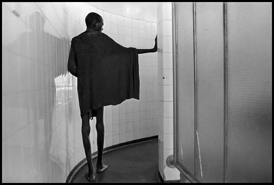
This first image is from a series on AIDS in Africa. It depicts a frightfully skinny man walking the halls of a tuberculosis ward in Zimbabwe. Not only is the subject matter enough to grab the viewer's attention but the strong composition just makes it all the more powerful. The tight space gives a feeling of being trapped as this man is trapped by his disease. The curving pathway creates a sort of interest as to where we are being led. The negative space is being broken down into geometric figures around the figure.
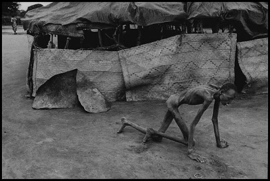
This next image shocked me even more than the last. It depicts a famine victim in Sudan crawling on the ground as he probably does not have the strength to stand. It is easy for any photographer to become so distracted with the subject matter that they forget about the rest of the composition, I don't think that's the case here. Seeing as this situation was obviously not set up the photographer probably had to act fast, making it all the more difficult to gain the intended composition. This photographer was able to act fast while still gaining a powerful composition and depicting the scene he wanted to depict.
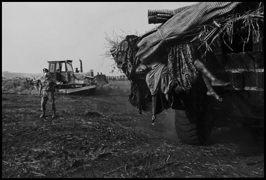
This last image depicts Hutu refugees being buried in mass graves after being struck by an outbreak of cholera. What is seen here is the completely inhumane treatment of these people after their death. The bodies are being carried by bulldozers and lumped together in "graves". One body hangs limply from the front of the bulldozer while a man in the background directs the bulldozer. The photographer handles the position of his subjects very well, adding more focus to the body by not depicting the entire bulldozer.
These are the type of images I hope to create some day. Photos that cause the viewers to think about what is going on in the world and make a difference rather than sit comfortably on their couches, getting fat and watching cartoons.
Subscribe to:
Comments (Atom)


