Tuesday, November 30, 2010

Fredrik Ödman

Fredrik Ödman's website doesn't say anything about him and at first it honestly didn't intrigue me but when I actually took the time to look through his work I began to like him more. I couldn't find the images online but there are some shots of rotting bananas under "Bent Stories" on his website that I thought Bridget would like. http://www.fredrikodman.com/


This is my favorite image by him but I'm not really sure why. Blue and yellow have always been one of my favorite color combinations since I was little so I guess that has something to do with it. The blue is repeated throughout the entire image through the toning of the image. The added texture also adds a really nice effect. The way the image fades out at the bottom adds even more mystery to the image as well.


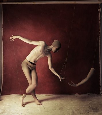
This is another one of my favorite images of his from the series "Pinocchio Dance". The way the figure is balanced on top of the other gives me this nervous feeling, like she's going to fall over any minute. The way the strings move your eye around the top of the figure and lead you through her foot, down her leg and to the bottom figure is just beautiful.


This is another image from "Pinocchio Dance". The slight severance of body parts in this image is amazing. The fact that the foot is placed higher up on the leg than it should be creates this strange effect. The image flows nicely from the tip of the figure's right hand all the way to his other hand and then on to the severed hand.

Monday, November 22, 2010

Photo II Proposal

For my photo project I chose the topic of "sequence with distortion of time". I chose to depict this using portraiture. I am going to have two models, one male and one female. My portraiture is going to explore the effects of light on the subject throughout different points of the day. I will use 5 different lighting situations (morning, mid-day, afternoon, dusk, and night) for each model (all 5 for the female and then the same 5 for the male). The background (outdoors) will not change and neither will the position or expression of the model in each of the 5 pictures. However the background will change between the two models. It was extremely difficult to find examples of this in the work of other photographers (which is kinda good because if a bunch of people already did it, why would I wanna do it?) but I did find a few who have work that mildly resembles certain processes.

Duane Michals (couldn't find a blog)

When I first decided on sequence, Duane Michals was the first person who came to mind. Pretty much any work i've ever seen of his is sequenced and this sequence is actually the one that Ron mentioned in class. The sequence flows impeccably; there are no odd breaks that makes the viewer wonder how one image could possibly transition to the next. I hope to learn from Michals' expertise in sequencing and incorporate it into this assignment.

Sam Javanrouh (not his blog but where I found him)

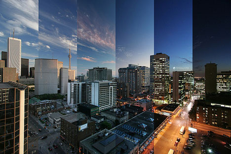
The concept behind this image is fairly similar to the concept behind mine. It shows the passage of time in a single city scape by combining multiple images taken at different times throughout the day. This image helps me to determine which times of the day create the most drastic changes in light seeing as the first 3 sections of this image barely change.

Leah Beach (Blog)

This image is by some chick named Leah Beach who I've never heard of before in my life. It is a contact print of a single subject photographed 24 times, each shot at a slightly different lighting situation. Each column depicts the subject differently; the first column is extremely well lit by the natural lighting where the last column is silhouetted by the fact that the sun has fallen. This image also helps me to determine which times of the day will ultimately effect the lighting of the subject.

Justin Quinnell (not blog)

This image is a long exposure taken with a pinhole camera. Although my images will not be long exposure images I hope that they will give the same effect; depicting time in a manner that the viewer is not used to seeing it. I am also considering choosing a background that will allow me to view the movement of the sun.

Hiroshi Sugimoto (website)

Sugimoto created images using extremely long exposures that lasted the duration of the film or play occurring in the theaters. I thought it was interesting how he solved the problem of reciprocity failure and had to figure out how to extend the exposure time using filters. If anything, I would like to convey the same feeling of time passing in my project.

Tyler Wescott (flickr [his website is blocked....apparently it's porn according to DCAD])

Once again, the passage of time is what intrigues me about this image. The fact that the photographer is able to convey this passage of time is something that I would love to emulate in this project. I'm noticing that manipulation of light in some sense is an excellent way of depicting this passage of time. While shooting for this project I need to have drastic changes in my lighting in order to convey this movement.

Michael Wesely (open shutter)

The passage of time is odd in this image. Often times when people think of what was once there they see it less clearly than what is currently there so the fact that what is being created is a faded and blurry creates a skewed sense of time. I was considering changing the surroundings in the image as well as the lighting situation but I feel like that will take away from the main focus which is the lighting.

JK Keller took a picture of himself every day for 8 years and turned it into a video (couldn't get the video on here so I linked the page)

Keller is not technically a photographer (he's a graphic designer) but this is technically photography so it totally counts! Keller chose to depict time by showing the changes time can bring to the human subject. He doesn't change the background but he doesn't change the lighting either. What he does change is the subject's appearance. This is an excellent depiction of the passage of time and I had also considered changing features of my models to make time seem to pass by more quickly.

Ulrike H (flickr)

I honestly hate this photo and don't see it as art. That being said, it is the only image I've been able to find that depicts the exact same subject in two different lighting situations. This is exactly what I want to do except with a model and using 5 different lighting situations....and I'm actually gonna do it well.

Alexey Titarenko (website)

This last image was first introduced to me by Randy last year in photo 1. We then saw them in person in a gallery in New York. The depiction of time has also become a depiction of chaos, allowing the viewer to see time in a different way than normally. The hands are grabbing onto the only thing which is stable in the scene, possibly implying that time is not stable and is, in fact, a mob of chaos. I hope to get my models in the exact same positions in order to gain that same sense of stability that is seen in the handrail.

Monday, November 8, 2010

Alexei Vassiliev

I found Vassiliev on 500 photographers but later realized we looked at him in craft class when we were using blur. I was thinking about doing something with color and blur for my digital editing project so I chose to do this blog on him. Alexei Vassiliev


This is my favorite image of his. I think I'm just really drawn to how vibrant the yellow background is. I love the colors he uses in his photography and I really hope to achieve this same effect in my editing project. Vassiliev managed to capture just the right amount of the figure, leaving a beautiful triangle at the bottom right corner. Using blur, Vassiliev forces the image to become more graphic than photographic.


Once again, I love his use of color! The blue is so intense it just draws your eye right in! I love that, in this image, the blur made it so that some of the blue is visible through the figure; causing the figure to have a blue tint as well. The fluid blue of the face which is higher up leads your eye away from the figure and back into the background.


I'm thinking of doing something similar to this one with my editing project except I want the clothing and the background to be complementary colors and I want to de-focus the camera rather than use motion blur. I love that no matter where your eye goes on the page it is always lead back to the figure. I believe this is because its clothing is a slightly darker hue than the background.

Monday, November 1, 2010

Scott Mutter

I came across Scott Mutter while we were looking through photo books in digital editing class to get an idea of surreal photography. I love surreal photography and it's what I want to try and do in my projects aside from my job. What's interesting is that all of his work is done in the darkroom which proves surreal images can be achieved without photoshop. I couldn't find an actual blog but I found this site. These are my three favorite images from the site.


I believe this image is made out of three separate negatives (the man, the escalator and the ocean). The geometric composition leads your eye all around the image. It starts with the figure and then is led over to the column by the wave, then it follows up the column and down the line and back up the escalator. I love how the photographer was able to flawlessly edit these three images together to form a beautifully surreal result.


I believe this next image was created out of two different negatives. I love the way the artist plays with the scale of the images, making the street scene extremely small compared to that of the church. It gives off this illusion that makes the church look like a skyscraper in real life. These images are, once again, flawlessly edited together.


I believe this image was created using only two negatives as well. This photographer edits these images together amazingly. It looks as if the scene was truly taken from reality. The height of the buildings is repeated below in the verticality of the columns. The one flaw I see is the perspective of the ledge is a little off from the perspective of the road.

Monday, October 25, 2010

Abelardo Morell

I'm going to focus on Morell's camera obscura and tent camera work because I fell in love with it when we visited the gallery NY. When I first walked in, I thought they were paintings because the textures looked like brush strokes. Then I looked on the back of the gallery card and it explained the process and I was amazed! He sets up a tent with a lens on top so that whatever the lens is pointed at is projected onto the ground inside the tent. The he photographs the ground. So that's why I'm focusing on these works specifically. You can find more of his work on his blog.


This image sort of explains how a camera obscura works. Morell most likely made this camera himself seeing as it's just a cardboard box with a lens. The repetition of the light bulb is interesting especially because the one inside the box is upside-down and a little bit larger. The overall tonal range of the image is amazing as well.


This was one of my favorite images from the exhibit! I love the texture of whatever material the image was projected on. I also love the fact that in all of these images, he uses what is actually on the ground rather than bringing his own textures into it which helps both the textures and and the image relate to each other. The one flaw I find in this image is the tripod leg. Why is it there?! It bothers the hell outta me! I don't know if he actually wanted it there or not but I don't see why he would! It's only in one of the others. I feel like if he really wanted it there he should've put a hint of it in all of them so it doesn't look so out of place.


This is also one of my favorite images in the series (the quality of this one is really crappy though). Once again, I love how the textures relate to the image itself. I also love how pretty much everything around the building is out of focus while the building is in focus. It really brings your attention to the building and allows for your eye to focus more on the textures around it.

Saturday, October 16, 2010

Tom Hussey

I found this photographer using stumble upon. I was hoping to find something that relates to the work I'm doing now with my final project and I believe the concept behind these images come the closest. The images depict elderly people looking into a mirror and seeing their youth instead of their reality. I really love this concept (although it made me even more scared to grow old). Tom Hussey's Blog


This first image depicts an elderly man staring into his bathroom mirror and smiling at his younger self in an army uniform. It's interesting how the colors of the younger man are more muted, making it look sort of like one of those old army photos. The bathroom itself is plain black and white for the most part which brings more attention to the two figures.


This next image depicts another elderly man staring at his younger firefighter self. It's interesting how everyone's eyes lead to the man in the mirror while that man looks back towards the elderly man. This draws the viewers eyes towards the mirror and then back and forth between the two men.


This last image depicts a woman sitting next to a mirror with a reflection of her younger self. I do not like the placement of the mirror (just because I feel like no one would put a mirror there in real life, but that's just me). Other than that, I love how consistent the photographer was with the lighting. both the figure and the reflection have the same lighting. Also the patterns from the window in the reflection are exactly where I would expect the pattern to be on the wall.

Monday, October 11, 2010

Erik Reis

I have to admit, I picked this photographer only because we have the same name (we even have the same middle initial)! Honestly, I found his site, Erik Reis, one day when I was googling myself (everyone does it so don't judge!). I don't particularly like most of his work but he does have some pretty decent stuff.


This is my least favorite image out of the three I have chosen so I chose to show it first. When I look for his work on google images (his site doesn't let you take the images) this was the image that came up the most. I don't know why exactly because he has better but whatever. I'm not saying it's bad because there are some redeeming qualities such as the repeating triangles (the road in the background and the negative space in-between the legs) and the overall tonal range of the image. I'm not sure exactly why I'm not fond of this image I just don't particularly like it.


The site that I found this image on cropped it for but I kind of like this cropping better. I love the contrast of this image (I normally don't really like high contrast). There is still so much detail in the darkness of the image. It gives a sense of being trapped or hope for "escape". The horizontal lines have a very organic feel as they mold to the form of his face.


This is my favorite image (that i've found) from this photographer. The elongated light pattern is at just the right angle in the image. The repetition bounces your eye between the window and the light pattern. The figure adds a feeling of loneliness to this image while also adding a trapped feeling resembling the previous image.