Monday, February 21, 2011

From Here To There: Alec Soth's America

Alec Soth decided to give out 4 assignments to all of his followers on Flickr and I thought these were the most successful from each assignment:

Assignment #1:


I felt this was the most successful because the artist creatively depicted the museum guard in a way not many people see them. It looks like it was shot with film as it has that beautiful color palette that comes from using color film. I felt like this one was best out of the ones depicted by far, the others seem amateur in comparison.

Assignment #2:


I wasn't sure if we were supposed to put up the whole photo story or just the one image so I just picked this one. I love this image because you can just tell it's right in the middle of a conversation, maybe they were talking about cigarettes. Also, the blue of her jacket matches and accentuates the blue of her eyes.

Assignment #3:


I'm not too sure who's the photographer and who's the person taking a picture of the photographer but i think the image on the right was taken by the photographer. It's such an odd image where you can't even see the person who's taking the picture from what I'm guessing is the flash. Also, the little girl on the left is sort of just floating in space, same goes for the clock above.

Assignment #4:
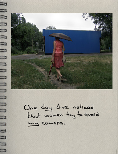

So this was the only picture depicted for this assignment…but whatever. I love the quote! I think it's hilarious! Only problem I have is I don't feel like she's trying to avoid the camera I feel like the photographer just shot her as she happened to be walking away.

Monday, February 7, 2011

Color Photo

Thomas Struth


I had to put this image because I just thought it was amazing! The colors make the people sitting in the church look like a part of the paintings on the wall. I don't know if it's just me seeing this or if I'm even doing this blog right (the paper was kinda confusing, Ron).


I'm not absolutely sure why but I really like this image. I love the way the tree hugs her head and the muted color scheme. The image makes the model seem pretty in an odd way because you know in real life she's not the best looking person, maybe it's just the image that's really beautiful…I don't know.


This last image is really strange. She looks like a mannequin, with her porcelain looking face and bright red lipstick. Her hair kind of looks like a wig too. The way the photographer activated the negative space   in the sky is amazing, it almost looks like the clouds are this explosion that bounces your eye around in the negative sky and brings you down to the figure.

Monday, January 31, 2011

Stephen Shore

So this week we read about Stephen Shore. You asked us to find two successful images and one unsuccessful image but I really don't like much of his work so I found a lot more unsuccessful.


This is the first image that I believe is successful. This was really the only image of his that struck me and  caused me to stop and actually look for a while. To me, the image is oddly cool and warm at the same time. I feel as though the subject is cold and this feeling is intensified by the cool tones of the blues but at the same time these blues feel almost warm and I'm guessing the season is summer just because of the pool.


This next image is the second successful image. I mostly only think it's successful because of the way the red really pops when it's next to the green (it's compliment). Other than that, I like the fact that the subject is perfectly centered in the frame giving the image an overall symmetrical look.


This is the unsuccessful image (obviously). I just don't see anything good about this image whatsoever! It's just food on a table, no beautiful lighting, no tight composition, nothing! It's even out of focus! It looks like someone made lunch for the first time ever and wanted to take a picture to post in facebook and show all their friends. It's stupid.

Tuesday, January 25, 2011

Color Photo Blog #2

After reading the article I looked at all the photographers given and I chose the three that I believe embody the words best. Doug Dubois, Larry Sultan and Todd Hido.


This first image is by Doug Dubois. I was immediately struck by the composition of this image. The movement from the blue object to the soap holder, down to the boy's head then up his hand and over to the flying dinosaur. Then I began to realize how mundane the subject matter was; it's just a boy playing in the bath tub! Dubois creates this beautiful image about something most people see daily and don't often appreciate.


This next image is by Larry Sultan. This scene looks like something out of a movie (in fact, I think this is on a movie). It's almost creepy, the large unidentified shadow creeping up on the woman in bed. But then you begin to focus on the quality of light shining across the couch and the scene becomes beautiful again.


This last image is by Todd Hido. Hido takes such an ordinary scene and makes it into this magical and creepy sifi image. Once you get past the oddly bright shining lights coming from the house and the blue snow you begin to realize that this is just someone's home, shot at night with a long exposure.

Monday, January 17, 2011

Color Photography: William Eggleston

William Eggleston is seen as the father of color photography according to an article we read as a class assignment. Apparently he would overexpose his film in order to give his colors the effect he wanted. I'm very new to color photography and seeing his images is an inspiring experience. His colors just have this quality that I believe can only be achieved with film. The mundane subject matter just adds to the color quality in an indescribable way. http://www.egglestontrust.com/


This first image struck me because of it's strong composition. The strong geometrical figures and lines leading you throughout the image along with the framing of certain objects is just beautiful. The fact that it seems like such an ordinary and everyday scene just makes it so much more accessible. I would love to see this image in black and white but I honestly believe it would just become another snapshot then. Although the composition might save a little of the beauty, most of the beauty is in the oddly soft hues of blue and that bright highlight of a yellow-orange coming from the left side.


This image is quite possibly the most beautiful photo I have ever seen! It's so plain…I honestly would never like an image this plain but there's something about the pure whites and slight tinge of color in the shadows. I'm not sure what color the shadow is supposed to be (Tate always does tell us that digital copies are the devil) but in this version the shadows are this strange smokey red. It's odd that I'm about to say this image would be terrible in black and white because the picture is almost colorless anyway but the subtle nuances of color make this image! And the whites! They're so pure and so…white! I can't believe such a plain image is getting such a reaction out of me!


This image struck me because of the gorgeous reds! I was out shooting today and I came across some red plant up against the snow and I tried so hard to capture the amazingly vibrant color and I just couldn't get it! When I overexposed it I did get close but it just wasn't the same. Anyway, these reds are amazing! I think the fact that they're up against a warm background helps to make them as vibrant as they should be. And then the cool blue sky just makes these flowers look like they're the warmest thing on this planet! Would this image work in black and white? Hell no!

Monday, December 13, 2010

Surrealism

We finally got "Process and Perception" by Jerry Uelsmann in our library and I checked it out so this blog is gonna be all about surrealism! I have a bunch of images by three different photographers (Jerry N. Uelsmann, Thomas Barbéy and Misha Gordin) which are all very similar to Scott Mutter (who was in one of my earlier blogs). I really want to study these works and learn the techniques which is why I checked the book out of the library.

Jerry Uelsmann:


Thomas Barbéy:


Misha Gordin:


Monday, December 6, 2010

Horst Hamann

I found Horst Hamann last year when we did our photo emulations and fell in love with the way he used a panoramic camera to create these beautiful relationships between NYC buildings. Horst Hamann


This first image is the cover of his book, New York Vertical. These are the first images I found of his (this book is in the school library). He creates relationships between the buildings by connecting them visually, no matter how far apart they may be. The two buildings in the front are connected though the angle of the roof on the left and the side of the building on the right. The building in back is connected through the tension created by the negative space between the buildings.


This next image is not from the same series but it still uses the same techniques to connect these buildings in beautiful ways. The center building is framed by the buildings to both sides of it. Hamann's spacing, composition and use of negative space also really helps to connect these buildings and reveal a sort of "intimacy" that any normal passerby would fail to notice.


The use of angles once again effectively creates a relationship between these buildings. The two rooftops mimic each other while the sides of the buildings follow in similar angles as well. I'm not really too sure how I feel about the vignette and the silhouetted building to the left but there is no denying that the relationships are still very strong.